Datadog Dashboards: Dive into Masterful Dashboard Design
Dashboarding and data visualization may seem deceptively simple initially, requiring no specialized training, especially when utilizing…

Dashboarding and data visualization may seem deceptively simple initially, requiring no specialized training, especially when utilizing platforms like Datadog, which offer an intuitive environment. However, this article aims to delve beyond the basics, concentrating on enhancing your dashboarding approach to serve as a comprehensive knowledge base and documentation accessible to everyone.
Add Context
Incorporating context is a crucial yet often overlooked aspect of effective dashboarding. Clearly defining team ownership fosters easy collaboration, feedback, and issue resolution. Providing detailed descriptions of displayed data and instructions for specific scenarios guides users in taking appropriate actions. Articulating the purpose and usage guidelines of the dashboard, including template variables, enhances clarity. Optionally, versioning, supported by external sources or simply by recording a last updated date in the description, can be considered to track changes and maintain the evolution of dashboards.
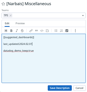
Context in Dashboard description or next to key charts
Add Visual Cues
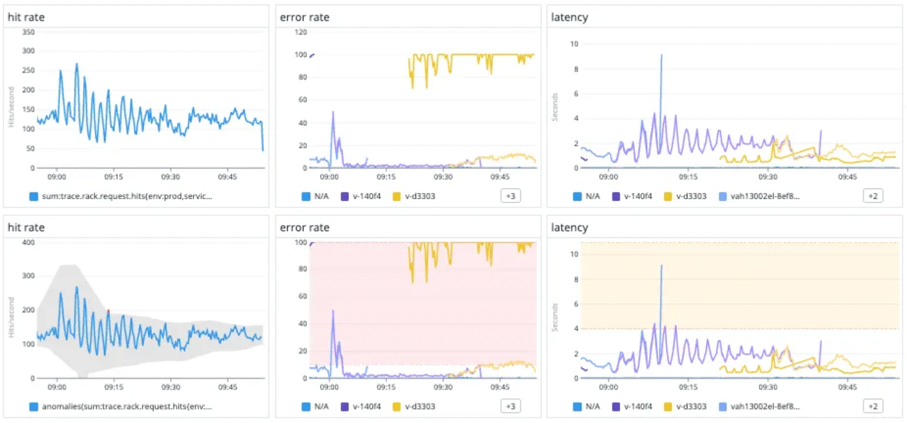
Visual cues play a pivotal role in enhancing dashboard effectiveness. Strategically using colors on graphs to signify normal and abnormal conditions aids quick identification of potential issues. Additionally, going beyond colors by utilizing functions such as historical comparisons or advanced machine learning algorithms defines what “normal” means in various contexts.
Consider this scenario: an incident occurs, and you want to investigate your current dependencies. Accessing the main dashboard of each microservice with ample context allows you to understand normal behavior and decipher potential issues.
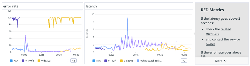
Now let’s take an example: which line is easier to read without even looking at the title or axis?
Dashboard Design and Layout
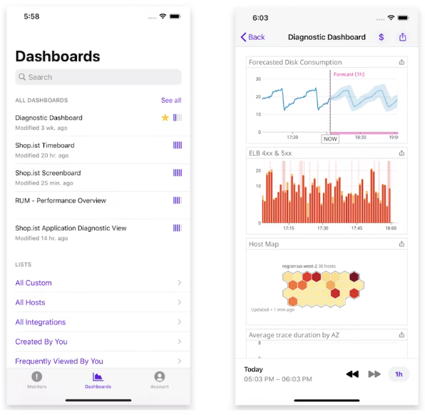
In the preceding sections, our emphasis was on individual widgets, but it’s equally critical to consider the overall layout encompassing sections. This strategic structuring facilitates navigation through organized topics of interest. Additionally, ensuring a responsive design is imperative, especially given the diverse ways dashboards are accessed, including on mobile devices.
Relationship and Links
Establishing a robust relationship and linking structure is equally important. This involves not only linking dashboards but also creating connections with monitors, service catalogs, and notebooks to enhance overall connectivity. Embrace the idea that the richness of content is often proportional to the number of interlinks, contributing to the overall quality of your dashboarding ecosystem.
If you want to have some fun, check out this quick script to better understand the connections between each asset.
Expertise and Community
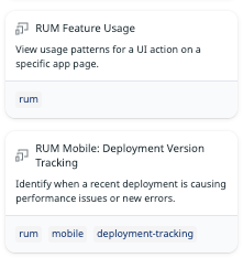
In the realm of expertise and community engagement, leverage central SRE teams in large enterprises to bridge knowledge gaps and prevent redundant efforts. Promote tools like Terraform, Pulumi, or embedded features such as Datadog Powerpacks. For their success, make sure that the reusable assets created are well-advertised, reviewed, and easily searchable for widespread adoption. Building a community around them is critical.
Datadog Powerpacks
Explore Datadog’s Powerpacks to extend dashboard functionalities. This feature allows users to publish and share groups of widgets seamlessly. Utilize Powerpacks to create pieces of knowledge to monitor standard technologies or dependencies. In addition, utilize Powerpacks to convey messages, global focus areas, key metrics, and quarterly goals across multiple teams, fostering alignment towards common objectives.
Access Control
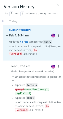
Like any asset created, the ability to restrict edit access is important to ensure consistency and validity of the data visualized. The first option available is to backup the dashboards on a regular basis on a version control system. This ensures traceability of changes and no typo or manipulation mistakes can happen. Additionally, in Datadog, you have the ability to restrict edit access to your critical dashboards, it also includes a version history to revert some quick mistakes.
From a visibility standpoint, Datadog operates on the idea that a single source of truth will accelerate troubleshooting and promote harmonious work with clear visibility with any dependencies. Setting access control to the data is generally advised only for security reasons.
Lifecycle Management
A dashboard can be viewed as a live piece of knowledge representing a specific system. It is essential to include the same concept of lifecycle management used in your knowledge base. Regular reviews should happen based on changes in the source code. A key trigger for a review is a postmortem, this is where dashboards can be improved to highlight specific cases and behaviors.
In conclusion, transforming dashboards into a valuable knowledge repository involves considering elements beyond the surface-level simplicity. By incorporating context, visual cues, robust linking structures, community engagement, and leveraging advanced features like Datadog Powerpacks, your dashboards can evolve into dynamic, informative assets for both immediate users and future reference.
Beyond dashboards, the increasing complexity we face is the depth and quantity of data a system can produce. Most companies are investing in AI tools to identify anomalies and outliers through the noise. Datadog already provides anomaly and outlier functions, including a service called watchdog looking for known anomalies and unusual behaviors. The next stage is building an AI with the ability to identify known patterns and use links and relationships from the data to automatically build a trail to follow during and after an incident. Learn more here.