Mastering Visual Hierarchy in Video Production

Creating effective videos involves more than choosing a good script or adding attractive animations. It's about clearly guiding your viewers through a carefully structured visual journey. This article explains essential design principles for video creation, focusing on visual hierarchy, sequencing, and engaging your audience. Whether you're a designer, marketer, or new to video production, you'll learn practical tips you can immediately apply.
Why Video Design Requires a Unique Approach
When people think about visual design, they usually imagine static media like websites, brochures, or posters, where everything is visible at once. In these formats, design tools like size, color, contrast, positioning, and typography direct the viewer’s attention effectively.

Videos, however, require a different strategy. Unlike static content, videos present information gradually, allowing you to control what viewers see and when. This approach enables you to emphasize important points clearly and reduces cognitive overload.
Think of static content as a map, and video content as a guided tour.

Avoiding the "PowerPoint Slide" Trap
A common mistake is treating videos like overloaded PowerPoint slides. You've likely seen videos with too much information displayed simultaneously—text blocks, images, bullet points—all competing for attention. This approach overwhelms viewers and diminishes effectiveness.
The strength of video lies in its ability to progressively reveal information. Begin with a simple introduction (such as a title and narrator), then gradually introduce points one at a time, supported by animations, visuals, or subtle transitions. This technique maintains viewer focus and improves comprehension.
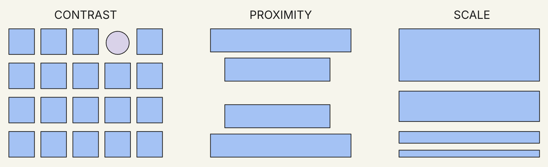
Using Visual Hierarchy in Videos
You can apply principles of visual hierarchy very similar to what you would do in a website, brochure or any other static content with a plus—contrast, size, and positioning—effectively within video content by adapting them to motion:
- Size & Scale: Highlight important content by increasing its size. Subtly scale down supporting information.
- Contrast: Use distinct colors to emphasize key points and actions clearly against the background.
- Timing: Show information sequentially, aligning visual cues with the script’s natural flow.
- Positioning/Proximity/Composition: Arrange visual elements on screen to guarantee your viewers will understand your message, maximizing for learning and memorability.
- Typography: Stick to a maximum of two font styles. Differentiate text through weight (bold vs. regular), color variations, or simple animations.
Each of these choices explicitly directs your viewers' attention, ensuring they understand where to look and when.
For users with low artistic skills like mine, this is where templates help a lot where you just need to find the right scene to present your point. The last element will then be to control the timing of animation based on the script.
Effective Scene Timing
Another common challenge in video production is maintaining viewer attention through appropriate scene timing. Generally, aim to introduce or refresh visual elements every 15–20 seconds. This is what our FOCA framework talk about with "Jingle the keys". This doesn't necessarily mean drastic scene changes; even subtle visual shifts, fades, or animations effectively signal progress.
For instance, if explaining three key benefits:
- 0–15 seconds: Introduce the first benefit with narration and visual highlight.
- 15–30 seconds: Transition visually to the second benefit, supported by relevant graphics.
- 30–45 seconds: Present the third benefit clearly with visual animation and supporting text.
This pacing creates a comfortable viewing rhythm, preventing content from feeling static or monotonous.
Using Signifiers to Guide Viewer Attention
An often overlooked yet critical component of effective video design is the use of signifiers—visual cues that indicate how viewers should interact with or interpret content. Unlike static visuals, videos require viewers to continuously adjust their attention. Signifiers help by clearly highlighting interactive elements, transitions, or important points, ensuring viewers effortlessly follow along.
Common video signifiers include:
- Arrows and pointers: Direct viewers explicitly to key information, guiding their eyes precisely to where attention is needed.
- Highlights and animations: Briefly animate or illuminate text and objects to emphasize critical points at exactly the right moment.
- Visual consistency: Establish patterns such as consistent color coding or recurring visual styles to subconsciously signal similar types of content throughout the video.
- Subtle transitions: Smoothly indicate the progression between sections, gently alerting viewers to shifts in content or narrative direction.
By strategically employing signifiers, you simplify viewer engagement and enhance overall comprehension, leading to a smoother, more intuitive visual journey.
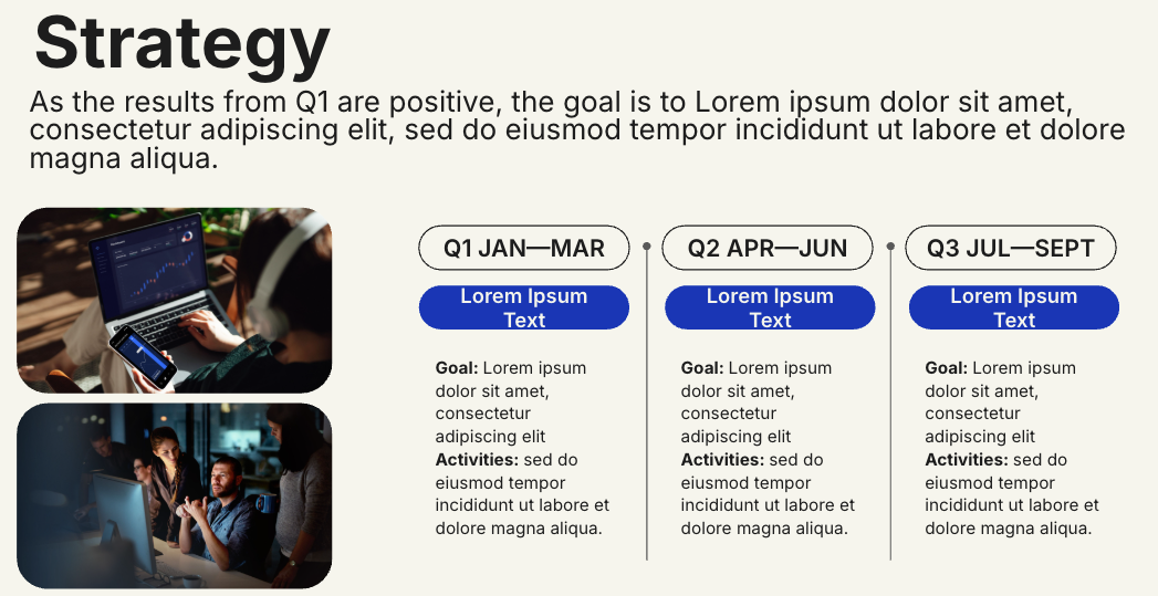
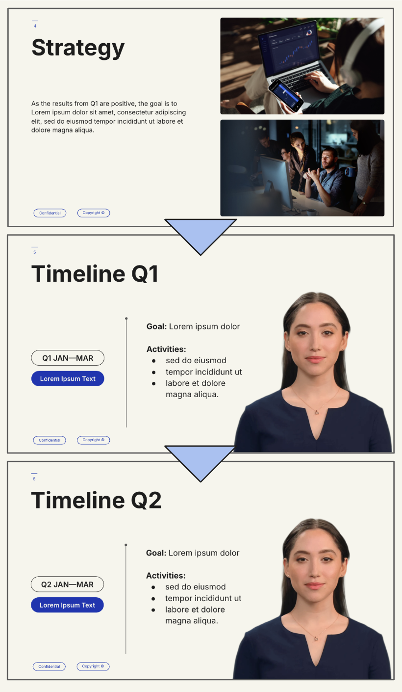
When to Use an Avatar

In most cases—around 90%—including an avatar is a smart starting point. As mentioned earlier, avatars add movement and personality, making your content more engaging right from the first frame. A human face on screen captures attention and builds trust, helping to maintain viewer focus and increase retention. That alone gives you two strong reasons to include one.
However, the decision to use an avatar should also consider the context of your video. Here’s when it makes the most impact:
- To build personal connections: Use a personalized avatar that represents you to create a more relatable experience.
- To explain content conversationally: Avatars help deliver information in a natural, human tone.
- To enhance understanding: For onboarding, announcements, or internal communications, a visible human presence helps information land more effectively.
On the flip side, you may want to skip the avatar in scenes where focus is critical—especially when showcasing complex visuals like diagrams, dashboards, or step-by-step instructions. In these cases, the avatar might distract from the core message. If you omit the avatar, make sure your visuals are animated or dynamic enough to hold attention on their own.
When you do use an avatar, place it thoughtfully—ensuring it doesn’t compete with important visuals. Proper spacing and positioning go a long way in balancing presence with clarity. Hopefully, Synthesia provides a lot of default templates to give you inspiration and get you started with high style.

🗒️ Think Like a Storyteller - Structuring Your Script Visually
Great video design begins with analyzing your script. Break it down into clear, manageable sections. For each part, ask:
- What are the 1–3 most important ideas?
- Which ideas can benefit from visual reinforcement? Images or videos that can help the illustration.
- How can visuals, icons, or animations better illustrate these points?
For example, if your script discusses multiple product features, introduce them sequentially, pairing each feature with relevant visuals and highlighting key text points clearly. This method significantly enhances retention and maintains viewer engagement.
Every video is essentially a narrative, and each visual choice should support this storytelling aspect. Regularly evaluate your scenes:
- Is this visual clear and uncluttered?
- Does this visual enhance or distract from the message?
- What emotions or understanding should viewers have at this moment?
- Is visual representation necessary, or can narration suffice?
Effective design needs minimal explanation. Your viewers should instinctively understand your message through clear, intentional visual choices, much like universally understood signs such as exit indicators.
Final Thoughts
Video is a powerful communication tool, but its effectiveness depends on thoughtful design and pacing. Instead of overwhelming your audience with too much information simultaneously, carefully structure your content using visual hierarchy, gradual reveals, and strategic scene timing.
With careful planning and deliberate design decisions, your videos will become more professional, memorable, and engaging. Remember to:
- Design with intention.
- Use motion, timing, and space effectively.
- Tell a story—not just present information.
Now, apply these principles in your next video, and enhance your skills with Synthesia or by participating in our FOCA class for additional expert guidance.
Special thanks to Roberto who shared all that insights!